Month: October 2012


Art Shows This Weekend
There are opportunities to see some fine local art this weekend.
As well as the Gallery Painting Group show at Byron Library, the Country Creations Artisan tour is on for Thorndale, Thamesford, and St. Mary’s. Great opportunities to get out and enjoy some art!
P.S. If your art group in London Ontario area is having a show, send a poster image to art@cherylo.ca no larger than 450 pixels wide at least a week before the event and I will try to feature it in my blog. Sorry, I generally don’t post about solo shows, simply because there would be too many.
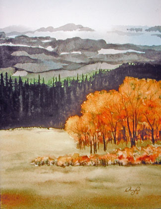
Painting from Photos
Below is the reference photo that I used to make this quick watercolour painting done as a demonstration in one of the classes last week. I thought you might enjoy a little mini art lesson. Here are the main points that were covered:
The background was done first, the trees last.
1. Skies often gradate from darker blue at the top, to lighter at the horizon. Even if your reference doesn’t show this, putting it in adds depth. /
2. Cloud shapes should be larger at the top of the page and get smaller toward the horizon. /
3. The colours in the original were very dull – why not make those distant hills autumn instead? /
4. Using dark silhouetted foreground trees, give a lovely glow of light to the background. This effect is called a ‘screen’ and was made popular in the Art Deco time period – early 1900’s. The Group of Seven sometimes used this effect in their work. /
5. Making up some shadows under the trees sets them nicely into the ground. /
6. Simplify the number of branches – only enough to indicate the brush. /
7. Near the end, I was going to do the green shapes on the branches. At the last minute decided it would be more fun to echo the orange/brown of the distant hills in the leaves. And since I liked how the background had turned out, might as well leave more of it showing. /
And the most important point of all?
8. A photo reference is simply a launching off point. Give yourself permission to change anything – colours, shapes – whatever your heart desires to make a more dynamic painting.

Knickers in a Knot?
Have a great weekend, everyone!
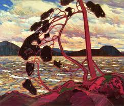
Tom Thomson
This is one of the best art history websites I have seen. You will need time to explore it – so much good information about this iconic Canadian artist – enjoy! And I really like their approach to the mystery of his death. Rather than picking one theory, they do a good job of giving a brief overview of them all. Here’s the link.. “Westwind: The Vision of Tom Thomson“
Painting: West Wind by Tom Thomson
6 Things I’m Thankful For
Thanksgiving this past weekend has me pondering the things that I am thankful for as an artist. Here is a partial list. I am thankful for:
1. living in a time and place where there are wonderful art supplies available. I can choose paints that are permanent and non-toxic. /
2. the many inspiring artists who have gone before that I can study and learn from /
3. the internet – so I can see so much great artwork, and network with contemporary artists too! /
4. amazing family and friends who help me and cheer me on in my creative adventures, including help with my website /
5. terrific art students to share this journey with /
6. Last but not least, a loving Creator who has made a marvelous world that I am continually in awe of. I could never paint more than just a tiny fraction of it in my lifetime. /
So much to be thankful for! What does your thankful list look like?

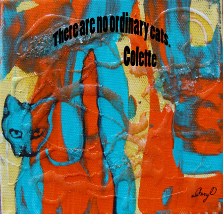
Cats
Today’s post is for all cat lovers. The painting “Cat’s Night Out” is for sale on Cheryl O’s website (minus the quote).

Handling Watercolour
Today’s tip is for watercolour painters. When painting, just put out enough watercolour paint to do you for that session. Do not put out your complete tube of paint into the wells of your palette. Once that paint dries it never gets as rich and creamy again when you rewet it. Practically speaking, this makes it difficult for you to make rich strong darks in your painting. Now, I know that some teachers tell students to put the whole tube out, so this is not to make you feel guilty if you have done this. I suggest that you use that paint up, and if you need an area of dark colour, put out a bit from a fresh tube for that. Fresh paint just out of the tube also gives a richer flow into a wet area too – it’s more fun and more effective. If you still end up with left over paint on your palette when putting out the smaller amounts, spray them with water and cover with plastic wrap to keep them creamy for a few days. Happy painting!