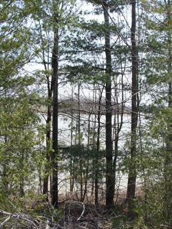
Below is the reference photo that I used to make this quick watercolour painting done as a demonstration in one of the classes last week. I thought you might enjoy a little mini art lesson. Here are the main points that were covered:
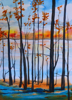
The background was done first, the trees last.
1. Skies often gradate from darker blue at the top, to lighter at the horizon. Even if your reference doesn’t show this, putting it in adds depth. /
2. Cloud shapes should be larger at the top of the page and get smaller toward the horizon. /
3. The colours in the original were very dull – why not make those distant hills autumn instead? /
4. Using dark silhouetted foreground trees, give a lovely glow of light to the background. This effect is called a ‘screen’ and was made popular in the Art Deco time period – early 1900’s. The Group of Seven sometimes used this effect in their work. /
5. Making up some shadows under the trees sets them nicely into the ground. /
6. Simplify the number of branches – only enough to indicate the brush. /
7. Near the end, I was going to do the green shapes on the branches. At the last minute decided it would be more fun to echo the orange/brown of the distant hills in the leaves. And since I liked how the background had turned out, might as well leave more of it showing. /
And the most important point of all?
8. A photo reference is simply a launching off point. Give yourself permission to change anything – colours, shapes – whatever your heart desires to make a more dynamic painting.