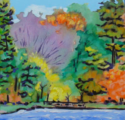
We had a discussion recently in art class about the concept of blocking in. This concept was a difficult one […]
Category: Tips and Techniques
Practical suggestions for working with your paint and references.
Backgrounds
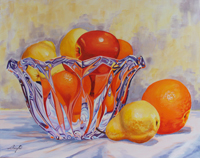
Sometimes I get it wrong. I recently gave some incomplete advice to a student about choosing a background colour. As well as considering contrast in temperature and in value, what I didn’t mention is that it’s really important to echo some of the colours used in the subject in the background. Take a look at some of your favourite famous paintings and check this out. Even famous portrait artists often throw some of those flesh colours into the background. Glad to say, the particular background involved was in oil paint, and not difficult to redo. Looking forward to seeing how the student’s painting looks this week! So when doing backgrounds, think about: value, temperature, and echoing colours that you have already used.
Iridescents
I use Golden brand of Fluid Acrylics, and the iridescent colours are available for those too. I like to coat […]

2 Rules for Oils
Anyone who knows me at all knows that in art, I’m not much for rules. It’s art – not brain […]
Ugly Stages
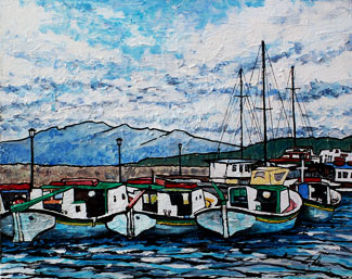
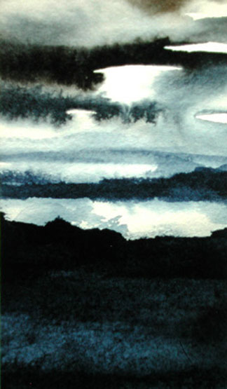
One concept that people new into painting have a hard time grasping is that paintings can often go through stages, […]
A Drop of Water
I thought that you might enjoy this very short animation of how to draw a drop of water, by Leonardo […]
Still Life Landscapes
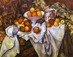
The connection may not be obvious, until you think about it. A good still life set up has a lot […]

Watercolour Paper
There are 2 basic types of watercolour paper: hot-press and cold press. It’s easy to remember the difference. Hot-press is […]