Veg1T

Drawing or Painting First?

I sometimes get asked whether a person should take drawing classes before learning to paint. You may be surprised to hear that it doesn’t matter which you take first. That is because they are very different skills, and there is only so much one absorb at once. Some excellent painters have a great sense for shape and proportion and that can be a different skill than understanding lines and edges. Granted, strong drawing skills can greatly enhance a painter’s ability. Beautiful line work can make wonderful art. Everyone understands that someone working at all realisiticly will benefit from drawing skills. What is less obvious is that beautiful line work also can be used to enhance abstract paintings. Most painters pick up drawing courses somewhere along their journey. If this is of interest to you at this time, I have a beginning drawing course for adults that is starting on April 4 at Westmount Branch library. Your choice of afternoon or evening class. It is being offered in two parts, each just 4 weeks long. Registration is done through the library 519-473-4708, and more info is found on my website “Local Art Courses” page. 
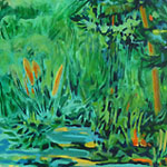
WetlandsT150

Green for the Irish

In honour of St. Patty’s day, I thought I’d share some of my favourite green mixtures. The can’t-miss-must-have mix is ultramarine blue plus any primary yellow. I find myself using cadmium yellow these days. This mix can lean to the blue, making a hooker’s green, or lean to the yellow, making a sap green. I never buy those 2 greens – they are just too easy to mix. The one green that I do buy is phthalo green (yellow shade). The brilliance of this colour cannot be mixed. Think brilliant emerald green. If you want to tone it down, a bit of burnt sienna does the trick. I also add yellow or blue to the phthalo green from time to time. And the green they put into beer tomorrow? I have no idea. Happy St. Patrick’s day everyone! 
RedCanoe250

Lazy?

There are some things in life you don’t want to be lazy about. Lots actually. Things such as: what side of the road you drive on… or… getting to the airport before the plane leaves. Things like that. Then there are the other less obvious things. Such as: change the water in your container before it’s a swamp. Long before. Because when you use that dirty water to paint with, it is subtly dulling down your colours. It really helps to have a larger container for water. 2 litres is good and the water won’t get dirty nearly as quickly as with a little container. Don’t be lazy – your art deserves better than that. 
AutG150

Go Green with Blue

I used to be horrified about the amount of paper towels that I went through as a painter. Too many trees! Then one of my students introduced me to blue shop towels. You can get these at local hardware stores. These towels are sturdy and absorbant. If you are using watercolour or watermixable oils, at the end of your session you can quickly rinse the towel out and use it again and again. Even with acrylics, the towels are so much more absorbant than regular ones that I use a lot fewer. Hope you will also go green with blue towels – and thanks for the tip Judy S. 
Tree12T

Calling It Done

A not uncommon problem for the visual artist is how to decide when a painting is finished. This applies especially to works that are moving toward abstract. Here are some questions you can ask to help determine whether a painting is done. 1. Has it captured the essence of what you wanted to express about this subject? 2. Does it have a center of interest that is in harmony with the whole? 3. Does the eye find a pleasant pathway to explore the painting? It’s always a good plan to leave it alone for a few days, then check it out again. Lastly, don’t be afraid to leave some mystery – undefined edges or shapes – so that the viewer’s imagination can participate in the work too.  
Tulip3T

Glazing

There are some similarities between a glazed painting and a glazed donut. The painting definition for glazing is ‘a transparent colour placed ontop of a previously dry colour, so that the previous colour shows through.’ This effect of transparent layering of colour can give beautiful subtle shifts in colour. The light traveling through those layers does indeed give a different effect than just mixing that colour to start with. It’s most challenging with watercolour. For best effect in watercolour, make sure that the paint is completely dry, and use a quick light touch to apply the next colour. You may be surprised how little the first colour moves if you do this quickly, because it takes a few seconds for the first colour to reactivate with water. Sedimentary colours, which sit up on the surface, make this more difficult than working with staining colours. If you aren’t sure which is which, a good quality artist colour will tell you on the tube. However the best thing is always trial and error – that’s how most of us learn. And donuts? Well, with a sugar glaze on a chocolate donut, the colour of the chocolate does show through. Conclusion: the main difference between a glazed painting, and a glazed donut is … calories. 
Girl8T

Putting Out Paint

Some artists have a real system for how they place their paint on the palette. I suspect it depends on how many pigments they prefer to work with – more pigments, more organization required. Some portrait artists in particular have very complex specific arrangement of flesh tone pigments and specific mixtures of these on the palette. Other artists like to use a colour wheel format. Since I prefer to work with fewer pigments, ideally 4 or 5 maximum, I don’t really fuss with where I put them on the palette, with one exception – the colour white. If I am using a white paint, I like to put it in the center of the palette so that I can easily pull it into the other colours that are placed around it. With white oil paint, I put a long ribbon of it in the middle of the palette. Then I can pull it into darker colours from one end, and lighter colours from the other end, and not worry too much about the white getting contaminated. 
Underneath250

Less Is More

There are many common misconceptions  about painting. One is, that the more tubes or jars of colour that are put out for a painting, the more chance there is of getting the colours in that painting right. In fact, fewer pigments make for the best chance of a harmonious colour scheme. I rarely use more than 4 pigments in a painting, and frequently prefer 3 plus white. Mixed secondaries – greens, purples, oranges – have the advantage of being related to the primaries they are mixed from. More important, a green mixed from blue and yellow can be mixed to sometimes lean to the blue and other times lean to the yellow. This gives life and interest to the colour that straight green from a tube is sadly lacking. So when putting out your paints next time, remember, less is more. 
Pear2T

Holding the Brush

Here’s an easy way to loosen up your painting. Try holding your brush farther from the tip. Most of us instinctively hold a brush closer to the tip when we want to do tighter realistic rendering of details. However, you might not have experimented with holding it quite a bit farther back when wanting a freer interpretation. Holding a brush differently can help you let go of control in order to make a painting more fun and interesting. 
Iris2T

Brain Surgery – or Not

I have no idea historically where the idea came from that it is bad to combine white paint with watercolour. As far back as the early 1900’s, famous watercolourists were not at all shy to combine white gouache with their watercolour paintings. I think it is a modern, and in my opinion, misguided practice to teach people that using white paint is ‘cheating’. I get riled up when someone says that. By golly this is art, not brain surgery, and I say – if it works use it! What’s the alternative? You have this beautiful painting and one small area has become too dark. You’ve done all the lifting you can and it’s not going to work. It would be such a waste to throw it out. Why not get out the white paint and fix it? What do you think?