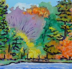
 The longer that I have been painting, the more I appreciate that good composition frequently comes down to one thing. It is – avoid 50/50 in every aspect. Landscape painters should avoid a horizon that is at all close to dividing the painting surface in half. Make it higher or lower. In addition, in any type of painting, it’s a good idea to avoid a half and half division between the amount of dark or light colour. Best to have the majority of the page dark with light accents or vise versa. The same can be said of warm versus cool colour, or textured versus smooth area, or hard versus soft edges. If in any aspect of composition you have to think hard about what is dominant and what an accent, then likely it is too close to 50/50 to be pleasing to the eye. Hope this is helpful, next time you are analysing your work.